
Still Rocking 100vh in Your CSS? You Might Be Breaking Mobile Layouts.
 Curator : Aakash Chavan
If you’re a web designer or developer who’s ever tried to create a full-height section using 100vh, here’s a wake-up call — you might be unintentionally breaking your mobile layouts.
🚫
100vh seems like it gives you the full screen height…
At first glance, 100vh seems like the perfect solution to take up the full screen height. And on desktops, it generally works as expected.
But on mobile devices? It lies.
Mobile browsers often have dynamic UI elements like the address bar and toolbars that appear or disappear as the user scrolls. When you use 100vh, it doesn't account for these elements — meaning your layout might overflow awkwardly, content could be cut off, or scroll behavior becomes unexpectedly clunky.
✨
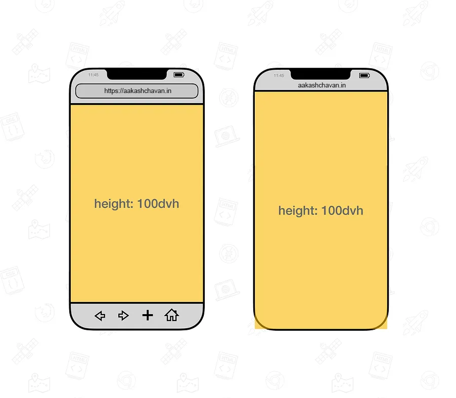
The fix? 100dvh — This little powerhouse respects the dynamic viewport height, adapting to changes in mobile UI like toolbars.
The CSS unit 100dvh stands for 100% of the Dynamic Viewport Height. It dynamically adjusts to the visible portion of the screen, taking mobile browser UI into consideration.
Unlike 100vh, 100dvh respects the real-time layout changes caused by:
The CSS unit 100dvh stands for 100% of the Dynamic Viewport Height. It dynamically adjusts to the visible portion of the screen, taking mobile browser UI into consideration.
Unlike 100vh, 100dvh respects the real-time layout changes caused by:
- Browser address bar resizing
- On-screen keyboards
- Mobile toolbar toggling
💡
Why It Matters
Responsive design isn't just about shrinking things to fit smaller screens — it's about making sure your layout works beautifully across all viewports.
By switching to 100dvh, you're ensuring that your mobile users get a smoother, more reliable experience without broken sections or unexpected scrollbars.
✅
The Fix is Simple
/* Instead of this */
height: 100vh;

/* Use this */
height: 100dvh;
It’s a tiny tweak, but it can make a huge difference in how your site feels on mobile.
Wrap-Up
In the ever-evolving world of web design, staying up-to-date with newer CSS features like dvh, lvh, and svh can keep your layouts clean and your users happy. So next time you reach for 100vh, remember — there’s a smarter, mobile-friendly way. Go dynamic with 100dvh.
In the ever-evolving world of web design, staying up-to-date with newer CSS features like dvh, lvh, and svh can keep your layouts clean and your users happy. So next time you reach for 100vh, remember — there’s a smarter, mobile-friendly way. Go dynamic with 100dvh.